
Over the course of these three decades, I’ve enjoyed this modestly lucrative gig, designing labels for Bell’s Brewery as the need comes up or as I see fit to meddle with my own suggestions. Since the humble beginnings of the brewery in 1984, I’ve presented close to 100 designs and perhaps forty or fifty of those ideas have seen the light of day as honest to goodness labels on beer bottles. I rarely actually knew when a new label came out, was modified or updated, nor is it always clear what’s a new issue and what isn’t. Collectors enjoy spotting minor variations in text or color or dates of issue and otherwise exercising their powers of discernment - in order to collect as complete an assortment as possible - and of course one-up their colleagues. I was once a collector of stamps and coins and I get what it means to find some rare oddity or even a mistake that all others have overlooked. What is or isn’t a separate issue and belongs in a catalog raisonne can, however, also get pretty fuzzy by midnight at a convention of passionate advocates – who all drink. What I hope you’ll find most appealing here is the history of what went into making the brewery and seeing that evolution reflected in its labeling. What I have to offer, are the stories I spin off around that development, alongside the actual artwork - and what was behind our using these images and my making them.

Beer Labels
Kalamazoo Brewing Company
& Bell’s Brewery
My becoming involved with brewery labeling was a fortuitous accident or perhaps a meaningful synchronicity, but hardly planned. I entered adult life as a scientist with a degree in zoology – concerned with obscure matters of ecology, evolution, systematics - involving fish and birds. Eventually I jumped ship for a sensualist’s ride in the arts, but even then I never aspired to commercial art credentials or went about looking for those gigs. My aspirations were for shows in art galleries and museums, and those paying gigs - they sorta just found me. Studio work interspersed with occasional exhibitions has indeed been the fortuitous trajectory of my calling. As a student I did make my own beer and through that minor and not particularly successful hobby, I found my way into the dawning craft brewing movement of the early 1980’s. I met Larry Bell back when both he and I were nobody with an exponent and I got involved with his brewery.
The upshot has been that for a select portion of our population here in Kalamazoo (mostly men in their early twenties and often of the fraternity persuasion) I am a hero of nearly Godlike dimensions, having scaled Olympian career heights to which they scarcely dare aspire. Ah, but to have designed a beer bottle label in one’s three score and ten and be satisfied to enter into the embrace of morpheus, in the full knowledge that it has all been worthwhile...
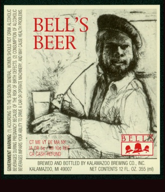
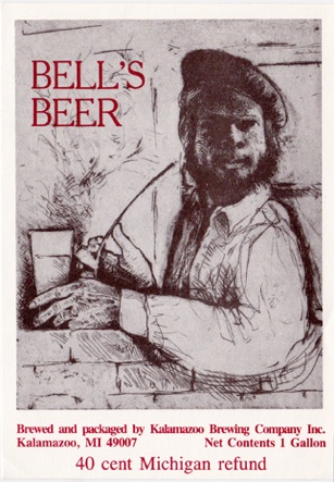
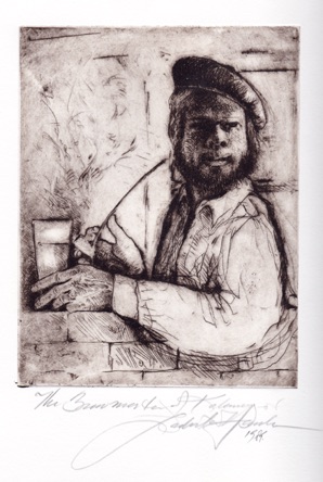
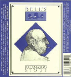
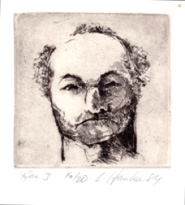
Here we have a portrait of brewery founder, CEO and at times cook , bottle washer, floor sweeper and all else useful, Larry Bell . This was one of the very first label designs from about 1984 depicting Larry as a handsome young man (with a little help from my 17th century colleague, Rembrandt Harmenszoon Van Rijn) His self-portrait as a posturing dandy served shamelessly as the basis for this portrait of Larry - with a nod to Adrienne Brower as well.
The campy historical reference seems well within the tradition-bound field of beer-making, which is always appealing to those Happy Days – Here Again, when men were men and beer was real beer in full compliance with the Reinheitsverbot (Purity law). Only the best ingredients, brewed with patience by gentle old graybeards with a twinkle in their eye and uncompromising old-world standards.

But I diverge from the task at hand.
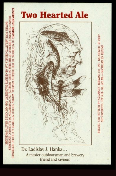
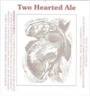
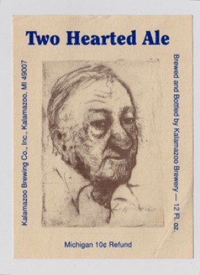
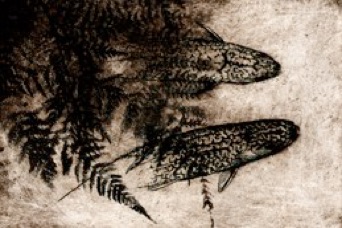
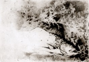
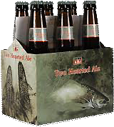
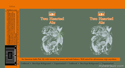
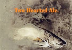
And a portrait of my father, Dr. Ladislav J. Hanka, early investor and active board member with a few of his beloved Brook Trout on an early incarnation of the brewery’s flagship beer: Two Hearted Ale.
So come with me as we turn the pages of time and go back – way back, back into the mists – back of beyond to a dimly remembered epoch before brewpubs had taken over every last vacant lot of Podunk, Paducca and Keokuck – back to Kalamazoo in the time of the warlords Montgomery Ward and Sears Roebuck the third; when Zayres department stores ruled supreme and burgers were flipped by living human beings on actual grills. Your time-machine backup function will be losing power and sputtering to a halt as we slow down and come to a hard landing in the early 1980’s at a time when Larry Bell was but a young feller trying to make ends meet as a short order cook at the Park Club and wondering what to do with his life. He was by then brewing bathtub beer and supplying friends, who for their part delivered cases of the coveted empty Huber long-necks to his back door after midnight. I was doing much the same and excited by Larry’s successes in producing far better beer than I and in his doing so under primitive field conditions.
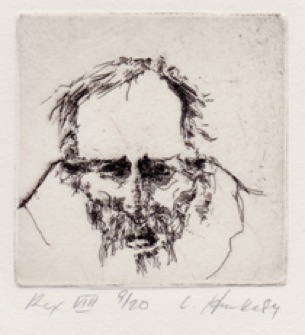
The Brewmaster of Kalamazoo (Larry Bell)
Etching with drypoint from 1984
Impressions available for 175.00 each
While I like seeing my art on a beer bottle I tend to harbor a secret little bit of resentment for graphic designers who take meaningful works of art and treat them as raw material to cut and paste, invert and posterize or deform and crop on their way to making of timeless art something that is campy, hip or glib. Because that designerly work is just about fashion, it tends to already be dated and out of fashion the minute it is made physically manifest – and that pains me deeply.
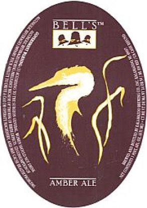
I cannot see how the shrunken outlined yellow Heron is in any way an improvement upon the original one in black ink on white paper, but will admit that it all seems to meet its appointed purpose of selling beer and does so quite well.
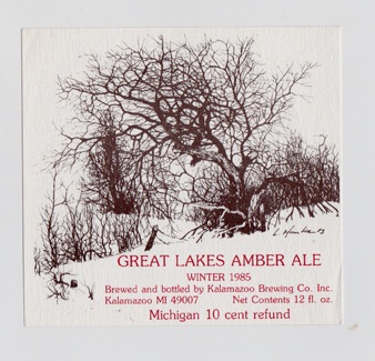
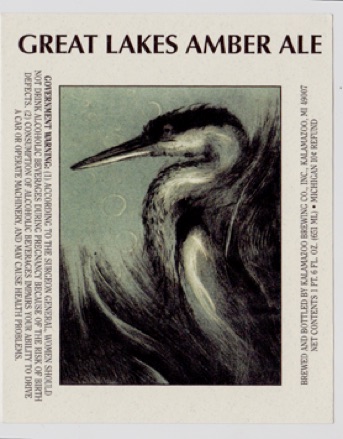
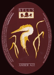
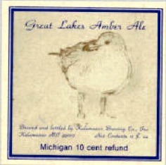
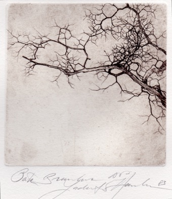
Amber Ale was one of the earliest flagship beers at the Kalamazoo Brewing Company and still is at Bell’s Brewery today. This old apple tree was on the first Amber Ale label from 1985. It’s a favorite label of mine from the early days when the graphics were cleaner and included little superfluous design, just a fine etching, well printed with some hand-set type. Here that type was the widely disparaged Cheltenham, which my mentor in the book arts and leading American type designer, Paul Hayden-Duensing, volunteered to melt and recast into a typeface worthy of being seen by the eye of man.
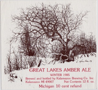
Great Lakes
Amber Ale Labels
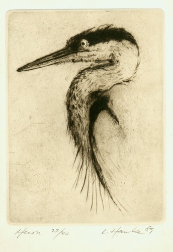
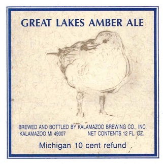
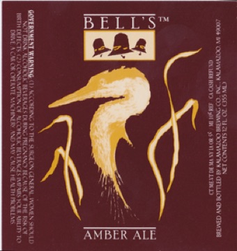
Heron, drypoint, 1989
This quickly done Heron drypoint ( inscribed with a diamond point into copper - without the help of wet acids) has become the perennial Amber Ale emblem. I did both the Loon and the Heron on an auspicious day in 1989 - just polished up a couple of plates and set to with a will . Lo and behold, I made two plates that day that helped sell absolute boatloads of beer and which were very good for my bottom line. Everybody wants the etchings. If I could be that prescient all the time I’d be hard pressed not to become a bit of a whore.
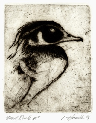
Wood Duck: Drypoint on Copper plate
An early label , this print began life as an advertisement for Larry’s hair-dresser, Damian Garry-Lee McCormick and his salon, called Garry’s Magic Comb. I’ve accentuated the swept-back elegance of the drake’s coif. I can however still never quite get over the incongruity of seeing a duck roosting in a tree nor fully accept a wild prey species being quite this extravagantly beautiful.
Impressions available for 150.00 each
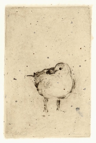
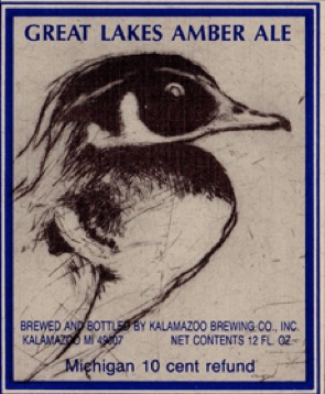
Ring-billed Gull, drypoint, 1985
I’ve heard them deprecated as rats with wings and don’t completely disagree. Gulls are indeed adaptable and aggressive survivors in the face of DDT, habitat loss, power boats and oil spills. They are like us, scrappers who get by, substituting parking lots for lakes and finding dumps a useful source of nutrients. They are also elegant, clean and sleek within the context of a life that stresses others onto endangered species lists. This magnificent ring-billed gull came about in a magical few minutes when with diamond needle in hand I inscribed her directly into a copper plate. On that clear January day in a parking lot by Lake Michigan, my exposed hand was in a race between expression and hypothermia. Impressions from the Gull plate printed Chin colle (i.e; printed and simultaneously laminated on a Japanese Chir-e paper) still available – but don’t wait long :
175.00 each.
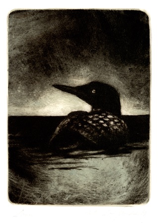
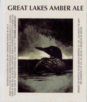
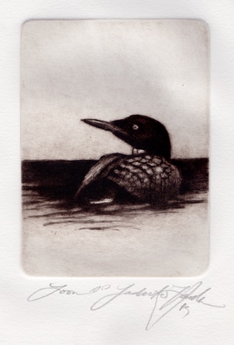
Loon etching with drypoint, 1989
Loons are mythic apparitions I associate with northern lakes in the mists of daybreak. They belong to those occasional visits we make to places that matter enough that we are formed by them. Loons are a significant part of the puzzle of human self-image that steadfastly flies in the face of common logic, refusing to see itself as a consumer of claptrap, but rather as a real being in dream-time. Loon song is an inseparable piece of the boreal lakes and once heard, remains with us to the grave. It is the song of life and death and the creature that utters it, a primordial bird who dwells among twittering modern birds without being of them, unchanged and enduring. Loons are sustenance of the deepest sort.
Impressions in Sepia available for 150.00 each
Herons stand in calm poses of utter balance and elegance, and fly with deliberate motions of utmost grace. Closer to pterodactyl than to cute little chirping birds, a heron will respond, to being treated as a pet, by calmly observing you, and then, without provocation or warning, put your eye out at a speed to which you could never hope to respond. It is a cold austere beauty— the Other—which has a life of hours spent in deliberation, interspersed with lightning strikes at fish and frogs. Very beautiful and very foreign.
Thus did our first post-prohibition home-town Brewery begin life as the Kalamazoo Brewing Company. Situated in various humble locations around town, it came to be that this little brewery was suffered by the grandioloquent mayor Ed Annen and the daughters of Kalamazoo doing his bidding at City hall and by the vast minions of both governor James Blanchard and president Ronald Reagan, at offices of Secretaries of State and BTA to be chartered in 1984 & entrusted for the public good; to make and distribute beer. The thirsty populace from thence onward, sallied forth in mirth and in sadness to Bell’s. In that eternal search for solace, they trudged up to the doors of the Kalamazoo Brewing Company, bearing their own refillable ‘cubitainers’ and returned home with sustenance.
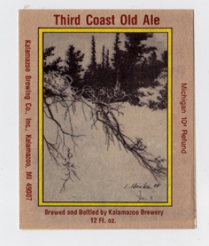
We all liked that Kalamazoo name which the world thinks to be quaint or humorous and presumed to trade upon that bit of good fortune in location with the company ‘s very name. Our attachment to the local scene with references to the Great Lakes strewn liberally about seemed a wise business choice and so our first beers were indeed Great Lakes Amber Ale and Kalamazoo Stout – even a Third Coast Old Ale.
A favorite Label of mine in which the design work, name and complete gestalt complimented and indeed enhanced the artwork for the purposes of advertising.
I was the artist Larry Bell knew best , but there were others whom he might have asked to design labels. Some were envious and even took umbrage at being passed over. I was, however, a home-brewer with opinions on beer and already making a modest living from art. I was also far more involved in the brewery than just selling Larry a few images – at a time when he could scarcely afford food and rent. I am guessing the reality is that, much like my knowing deep down in my gut, that Larry had the drive to succeed in business, he too had the human insight and intuitive radar to see an artist who wasn’t all talk, but who walks the talk and simply enough, keeps on producing. I gave him a great number of designs with which to work and he used them creatively. It didn’t hurt that I believed in him and asked for no money, but was willing to work for some stock in his then worthless little company - well actually, less than worthless. I imagine that stockholders in an indebted concern have negative value in hand. I knew then already, that it would be my nest egg and retirement someday and that sending my father and his cronies over was also a wise investment.
I no longer participate in the affairs of the brewery, since the day that my suggestion at the annual shareholders meeting for an alcohol free brew called Soberon was vetoed- nay, outright torpedoed (with a smile from those who knew better than I, what it takes to make a near-bear) – nor do I own stock in the company. That’s all in the past. I do however, take distinct pleasure imbibing the refined substance that is a consciously made beer and and I did have a great grand uncle who was the master maltster at the Pilsener Urquelle brewery in Czechoslovakia – so who knows what genetic markers that might involve. (We, incidentally, call it Plzeňský Prazdroj).
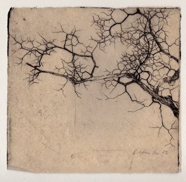
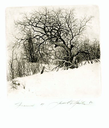
Fencerow 1982
7.5" x 7” Etching
People tell me that I have succeeded in capturing something universal with this image of a long untended apple tree; the strands of barbed wire tangled in a blackberry thicket in its overgrown lower branches making for an impenetrable fencerow. It could be most anywhere, but many people tell me they’ve seen this tree and know exactly where it is located – yet the tree was cut down soon after I inscribed its image into copper some thirty years ago. My father is convinced it’s the best thing I’ve ever done – which would also imply that it’s all been downhill since 1982. I doubt he’d actually want to say that. He likes it and that counts. So do others. So did Larry Bell back in 1985. And it ain’t all that bad, if I do say so myself.
Signed impressions of the etching: 350.00
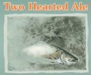
Among those flagship recipes I particularly enjoy, Two Hearted Ale is a consistent prize-winner in many a beer festival. This highly original and super hoppy but also well malted ale recipe was first developed by Rob Skala. He and his rocket scientist father (who really does have an aero-space firm that makes and sells rocket parts or components) were early and major investors. They, like Paul Todd, Timothy Light, Neil Shakur and Don Shooks were among those upon whose faith, good will and cash reserves the firm stood in the early days. Rob died in an unfortunate drug overdose, way too young and indeed, stupidly. He left behind a four-year old child, but youthful impulsiveness aside, I always liked the guy and so it was a pleasure to see his memorial service so well attended and more recently to note that the pub now offers the original Two Hearted Ale recipe alongside the current one. They are in truth not too different from one another and one can hardly be too adamant that one is better, but it’s a sentimental favorite for me. Of course the Bell’s Two Hearted Ale is today widely imitated on both sides of the Atlantic. This is one of those new beer styles that has come out of the American craft brewing renaissance and established American beer brewing on the world stage. Those high specific gravity, dry-hopped, candy beers that are to men what chocolates are to women – got their start right here.
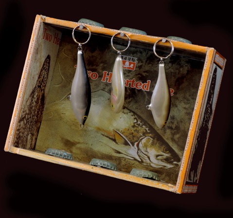
But back to beer labels, advertising and packaging. Here I imagine, is the most successful packaging the brewery has yet to come up with and whose six packs and bottles are ensconced as altarpieces in fish camps from Maine, to Wisconsin and all the way to the pacific Northwest. I’ve seen them in various fish camps across Michigan’s UP - even saunas on small islands off the Keweenaw, on Crown Land shacks across the north shore of Lake Superior and on Isle Royale National Park.
Now it wasn’t always so and the Two-hearted Ale has gone through many labeling incarnations including a full blown-out controversy with threats from lawyers - all about to be unveiled from the shrouds and mysteries of time.
Small investors continued to turn up – mostly Larry Bell’s friends and their parents and a trickle of Upjohn scientists - most of whom knew something about microbiology and chemistry. Foremost amongst these knowledgable investors was my father, whose work involved teams of technicians and massive pharma-ceutical fermentations. Beer and wine production were hobbies for him and of course represented a very rudimentary (if entertaining) level of microbiology. For a Czech emigrant, though, making beer was a return to his ancestral roots, (just like war-time), when you had to get creative and make do with materials you had at hand. He enjoyed it and highly approved of a young man like Larry going into business – charging off with the noble goal of making better beer than Miller or Anheuser Busch – launching those pebbles at Goliath. And, oh yes, father was down there at the brewery a whole lot in those days, trying to put aright the various elementary fermentation errors being made by his brewery pupils and teaching the boys down in the bowels of the operation about aseptic procedures (come on - wash your hands guys - several times a day if need be) and isolating single yeast cells and regrowing their cultures anew and all that it takes to make beer that doesn’t taste of vinegar or worse. Anyhow he was the occasional savior of the brewery when a few bucks was what it took to pay the sales tax or rent, or get a new and more savory yeast culture started – when Larry needed a fatherly talking to or a slap on the back. Sometimes it was to be told to pour a batch of skanky beer down the drain and swallow the loss - other times advice on more personal things. Father’s buddies kept buying modest amounts of stock and kept it all afloat from day to day and then a few wealthy patrons from around town joined in. Paul Todd Jr., former Senator and owner of the local spice extraction firm, Kalsec, was the first. He made hops extracts, among other things and what could could be more interesting than a small scale testing ground for his ‘Hoppy Drops’? The brewery made its mistakes in small scale which didn’t break the bank, but just hurt. Eventually it started making money and once the biggest dangers were safely past, the intrepid bankers of Kalamazoo started exhibiting interest in lending their ill-gotten cash to build up industrial capacity.
The brewery slowly grew and those of us involved, contributed our skills, voices, complaints, sage advice, business acumen and monetary investments, until it all grew to become much, much more than just a local endeavor among several friends, colleagues, alcoholics and their parents. Our brewery has become well known as one of the first great American makers of craft brews and a flagship within the renaissance of post-prohibition American beers. That movement has placed American beer squarely in the forefront of innovation and quality brewing – after a long, long, dreary time spent as a complete backwater that was not to be taken seriously. It happened pretty quickly and went against the flow of some massive industrial and financial interests.
Somewhere along the way our brewery shed its Kalamazoo name and became Bell’s, recognizing the shorthand already in wide circulation of stepping out to Bell’s for a cold one and indeed honoring that the brewery existed by virtue of the vision of Larry Bell – his years of hard work, tenacity, bull-doggish bite, diligence, combativeness and all else one might say about the person whose baby it ultimately is and who at the end of the day, signs the banknotes, exposing himself to the greatest risks and the greatest benefits. And of course the brewery kept growing from a Microbrewery inside a brewpub until now it is one of the Country’s larger and most eminent breweries with two of its own state-of-the-art industrial brewing facilities as well as the original brew-pub downtown – and it has still avoided being swallowed up by any of the hydra-heads of the huge engine of destruction which we might as well call the Engulf and Devour Corporation with their Clydesdale horses, fake home-town cheer – ‘it’s Miller-time!‘ bravado, movie star endorsements and Superbowl ads.
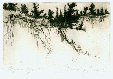
Blow-out sand dunes, Cedars and White Pines are among those symbols of Michigan we all tend to discover early and which form us in our three score and ten. They have a way of becoming the sentimental memories that feed us through hard times and give us solace in age – surviving the depredations of senescence and dementia - taken to the deathbed and perhaps beyond. Those blow out dunes have staying power deep within one’s soul and draw us back to the Great Lakes, to wander the shorelines – until the day comes when those old legs can no longer carry us up and down the loose sand and such pleasures must be left to the young and limber.
Paul Todd Jr was an early investor and long-term supporter of the brewery He also had his place on the beach near Covert which he shared with many in this community - a salve for the soul. This scene on the label could easily have been from Paul’s place or from Saugatuck Dunes State Park, perhaps even the Sleeping Bear Dunes National Lakeshore, but this image was in fact drawn at Wilderness State Park, somewhere between Cross Village and the straights of Mackinaw and therefore done in places that may feel natural today, but which were among the oldest settlements in the Great Lakes basin.
Here the Anishaabe villages were already well established when the first French fur traders arrived with Jesuit missionaries to our shores in the 17th century. Remains of seals, whales and walruses show up at these places, indicating a very different fauna, only a couple of thousand years ago. And of course the place is still home to the endangered Piping plover, with gar and smallmouth bass, as well as the occasional sturgeon prowling the shallows nearby. It doesn’t get much better.
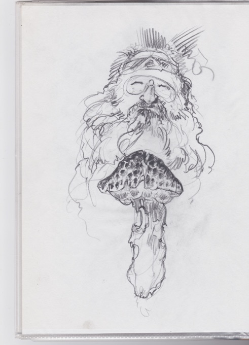
Ranger Bob
Portraits of Bob Kull – camp ranger from Merrie-woode Girl Scout Camp - near Delton Mi.
These drawings were made in preparation for a Ranger Bob memorial six-pack at Bell’s Brewery to honor Bob Kull – a guy who cast a broad web and was widely loved – and of course to honor Bob’s many contributions to the Brewery. The posthumous drawings have yet to make it to that exalted status of a mug on a beer bottle, but I still harbor hopes or perhaps hops ...some day.... mmm yes.... to honor Bob’s memory...and have some fun with it.
Follow the hyperlink (arrow) to another page by clicking on the picture to your left and you’ll be able to read far more about Ranger Bob and see another dozen drawings of him and his mushrooms.
I sought to introduce this boy wonder with his cool home-brewed beer to my father, the fermentation biologist. And it came to pass that our pater familias descended upon the young upstart infidel of fermentation – brewing his strange English style beers in the equivalent of unsantized and cast off diesel fuel canisters. Father deigned to taste of said illicit and proffered product. Finding it promising and indeed, verging on adequacy (a big admission for a Czech beer patriot) he pronounced it potable. Doing so, he went so far as to share it with his buddies over at the Upjohn Company labs. They were all polite - well, actually more than just polite - encouraging. He and his buddies wanted a brewery of their own in town - thought it would be fun and worth the modest investment. And so it was that Bell’s Beer was not to be stillborn for want of shekels. Modest weights of coinage were bestowed upon Larry Bell to rub together until warmth was generated and a business plan formulated and better equipment acquired and made functional. Father called him every other day and asked the pointed question, “Is the beer flowing?” And there came a day when the answer came back in the affirmative ... and money was made and beer distributed far and wide. And we looked upon what we had wrought and pronounced it good.
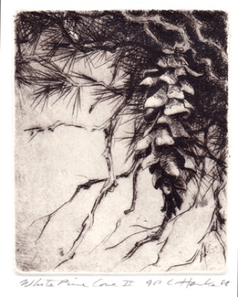
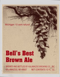
White Pine Cone - drypoint on copper plate
impressions available at 150.00 each
Loon - color plate - impressions available for 250.00
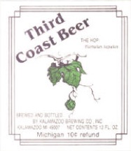
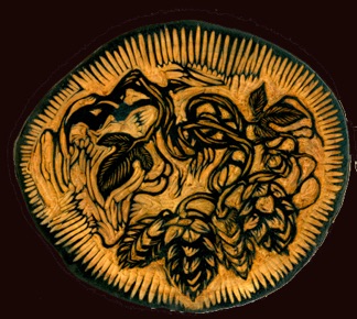
Third Coast Beer
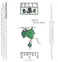
- or fourth coast, depending upon one’s attachment to the Carribean/Gulf Coast. The Great Lakes are for us, where it’s at - symbol of all that is pure and wholesome and worth going to the matt for - this part of the earth we inhabit and were entrusted to husband, protect and preserve. These little Hops drawings began life as decorations on glasses at the Brewpub and then migrated to the Harvest Ale. At a certain point in the brewery’s existence, all the friends of Bell’s would gather wild hops and contribute to the harvest, with the understanding that we’d also be first in line to buy the beer before the general public . And indeed, there wasn’t much left over for the poor blighters who didn’t climb trees and skin their knees to gather hops. It was fine indeed - a reserved midwestern version of the Bacchanal of the grape harvest where we like to imagine buxom young lasses pulling up their skirts to expose bare legs and stomping around in the grapes with heads leaned back in song or laughter, hair in tangles, dancing and falling in with utter abandon while the band plays and everybody gets drunk. My own hops harvest was mostly from plants growing in my yard , which came from a mix of whatever rhizomes Larry once dumped on my porch. Other hops that I brought in came from fishing trips into the Escanaba River basin, where I like to imagine moonshiners, Redfins, wobblies and refugees from prohibition homesteading and risking jail time while tending their beloved rhizomes to bring forth the liquid of the Gods for the joy and contentment of their fellow man.
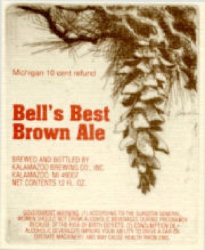
True to its name and a mighty fine
smooth, creamy brew - also
quickly satiating. One does it for
me. It is as strong and
unashamedly itself as its depicted kin the Bur Oak - though not astringent or tannin laden as an Oak twig brew would probably be. The Bur Oak branches depicted on the label are from around town - one of those trees that dominate our skyline here and with its knotted arthritic knuckles, gives Kalamazoo a true sense of place that is genuine and of this place and ecotone on earth. We have a lot of old Bur Oaks in town , some of which even predate colonization - many of which have still miraculously eluded the County Road Commission and various chain-saw-bearing nitwits who enjoy way too much power to wreak havoc in our environment. They are not the sexy tree which arborists and landscapers coming from the penthouse suites of Chicago architectural firms tend to favor. They make no real money for the cultivators of exotic trees who are so enamored of recessive corkscrew and weeping alleles grafted into Balkan Pines or Madagascar Baobs. They just belong here by virtue of having successfully adapted since the last glaciation. Bur Oaks have grown old and magnificent here in this part of the world because they have a rough tough exterior - a deeply furrowed and nearly fire proof bark that has allowed them to survive millennia of prairie fires. They are the Redwood of the Prairie and can indeed, be stupendously magnificent.
This was one of the very early labels that stayed essentially the same all along but did undergo many small changes - enough to keep a collector happy as a clam, examining all the slips of gummed labels, each with a slightly different color of type or border. The etching itself remains the same and that was originally inscribed into copper on the shores of lake Michigan at Sturgeon Bay in the southern part of Wilderness State Park.
These etchings tie into a long tradition of artists who’ve returned to their own humble roots and drawn the common man. From rembrandt’s ragpickers to DaVincis’ caricatures of Italian peasants, artists have been amused or fascinated by those who are not moneyed merchants or aristocrats capable of paying the artist. Callott’s etchings of French peasants were among the first explorations of the medium. Two hundred years later, Millet treated the peasant as the humble carrier of profound , yet simple human virtues. Much of the 19th century romantic movement centered on the peasantry as the repository of culture and mined that folk culture in pursuit of creating nationality-based high culture. Some artists express social consciousness and sympathy for the troubles of the poor in their work; for their poverty, dispossession, exploitation, hunger and ill health. Some find humor in the depiction of social fringe elements and outlandish or deformed features, yet a common denominator is that the human condition, shorn of fashion, is timeless. You ultimately see little difference in these people from one century to the next. The signposts of social station are mostly absent and the artwork carries quite another timeless message - that dust you are and to dust shall you return. Most of us are a paycheck away from this state and there but for the grace of God go you and I. All is vanity.
Spend some time among the dispossessed and poor and you too will see that it’s complicated and what you had thought about them and what you were doing there is inadequate to conveying truth - like it is about anybody else. The cute, campy, bawdy side of it all is truthfully observed and of course just a good rip snorting hoot, but then again at a deeper level, it is not so at all. Pull out a camera in a low-life bar where the drafts are dirt cheap and smell of antiseptic glass rinse and it will be as if you’d pulled a pistol. But you can draw the people - mostly.
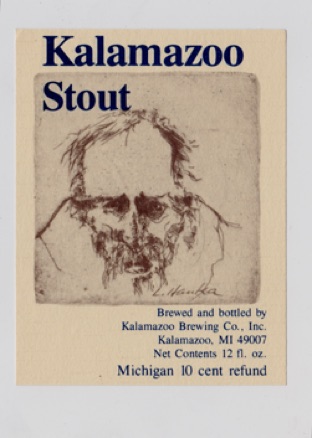
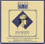
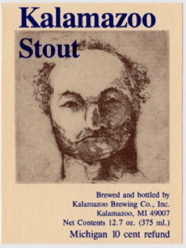
So then the Kalamazoo Stout labels: They’re heavies from the wrong side of the tracks on something not to be confused with a light beer. Bleary-eyed aggressive louts and failed advertising execs insolently staring back at you from the label with a look of ; “what the f… are you looking at?” And it’s an advertising/packaging strategy that has worked. The beer looks very different from anything else on the shelf. People buy it and discover that it isn’t just another computer lager in a strange package.
I must have supplied Larry Bell with about 25 of these etchings and some were used pretty much as is, without a lot of graphic design ruining the art. Others got away from them. You can click the pictures with arrows on them and be immediately linked to another page where the collection of Stouts and stout fellows is indeed voluminous and complete.
Any of the Stout Fellows is available as an original hand-pulled etching on archival rag papers for 125.00 each or a full set of them for 2,000.00
Oak Branches - etchings on several papers
still available at 125.00 each.
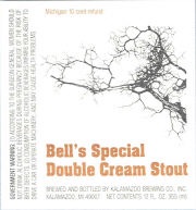
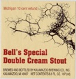
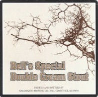
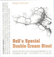
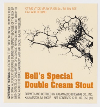
Bell’s Special
Double Cream Stout
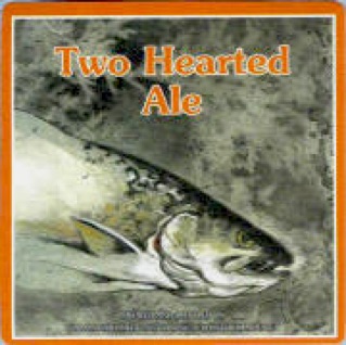
Brook Trout
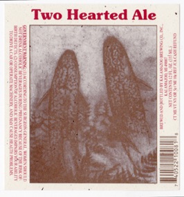
The greatest of the Two Hearted Lables - All the Brook Trout – All the Time
Salvelinus fontinalis is the brook trout (Brook char or even Brook Martin) native to northeastern America. Here I have taken my models from fish caught in the Montreal River, flowing out to Lake Superior and draining the Keweenaw outcrop of Michigan's Upper Peninsula. Here the Montreal River drains a wilderness of tag alder and cedar swamps, where we find pockets of old growth forest and a single stand of original white pine, which has miraculously eluded the screaming chain saws. The trout are wild, rather than hatchery hybrids and exhibit an uncommon diversity of form – heightened by being taken during the spawning season, when males develop prominent hooked jaws and bright colors. You can occasionally even turn up a coaster near the river mouth and I only hope everybody feels honor-bound enough to release those rare genetic treasures.
Follow the link to this longer series of explorations on another page and you’ll see that though I may have touched up this etching with a bit of sparse coloration for the label - taking my cues from master colorists Carravagio and Rembrandt, I have for the most part chosen to suppress the trout's naturally brilliant coloration, the oranges, blues and reds which otherwise would eclipse their graphic elegance. Instead I have explored the splendid variety of form and pattern evident in these fish, through the black and white medium and inscribed them laboriously into copper plates.
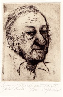
John Voelker AKA Robert Traver - one of Michigan’s grand-master story-tellers.
Voelker was a Michigan Supreme Court Justice who tossed it all away to move back north, fish and write. He was the author of Trout Madness, Danny & the Boys and many another fine fishing story ( Anatomy of a Murder too ), a lover of things fungal, promoter of higher education in law for Native Americans to defend themselves more effectively and many, many more such laudable things. This etching was done in situ within the confines of his native habitat, the Rainbow Room tavern in Ishpeming. That was in 1988 and thus only shortly before John’s death. And – this is where the controversy regarding the Two-hearted labels comes in.
Once John was safely dead and couldn’t protest, his widow had her own ideas about how his memory should be resurrected, redacted and honored – and that did not include his being depicted as a stinky old fisherman whose nose was criss-crossed with little burst veins earned by investing heavily in Kentucky bourbon futures. She’d had a lifetime of frustration with his manly peccadilloes and didn’t need to live with them post-mortem as well.
Letters from her lawyers followed the appearance of this label and its borrowed but also opyrighted ‘Testament of a Fisherman’, making it amply clear that being embalmed on a beer bottle may well have been his idea of a legacy, but that she survived him and was paying the lawyer’s bills. This kind of label on a beer bottle was not where things were going to go with her deceased husband’s memory. He of course was born to a bar-keeper daddy and his grand daddy owned a brewery, and we, who read his books and quote them and live by their insights, feel like this is hardly a dishonor, but......all that is in the eye of the beholder, eh? Click on the the images with little blue arrows to be linked to pages with lots more about all of that and more pictures of John and Frenchman’s Pond and all else.
The Big Two-hearted River is a place of mystery. Deep and dangerous tannic waters you cannot see to step into, are filled with drowned timbers and cedar sweepers - the stuff of legend. This and the very name itself is why Ernest Hemingway set his story about the shell-shocked veteran returning from WWI in that place. The far north sustains our mythic aspect - what we too have come from so long ago and hope desperately still exists somewhere. Fishing stories and lumber jacks. Moonshiners and poachers. There still needs to be a place, at least in the imagination for all of this – out a piece and away from polite society, where every tree is still not counted, totted up in a ledger and owned by some monopolistic concern situated in a Cayman Islands mail slot for tax purposes. All those French-Indian half-breeds, Red Finns and old-time German subsistence farmers with their stills and hunting camps need to still be something like they were back then – in the good old days and co-existing only uncomfortably with the law and high-society decorum .
Dean of Michigan trout - John Voelker The etching is available for 150.00
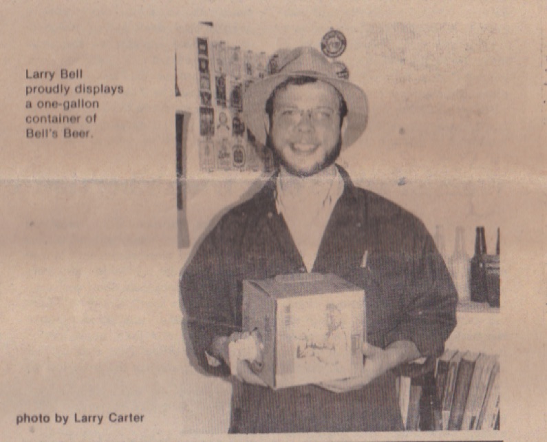
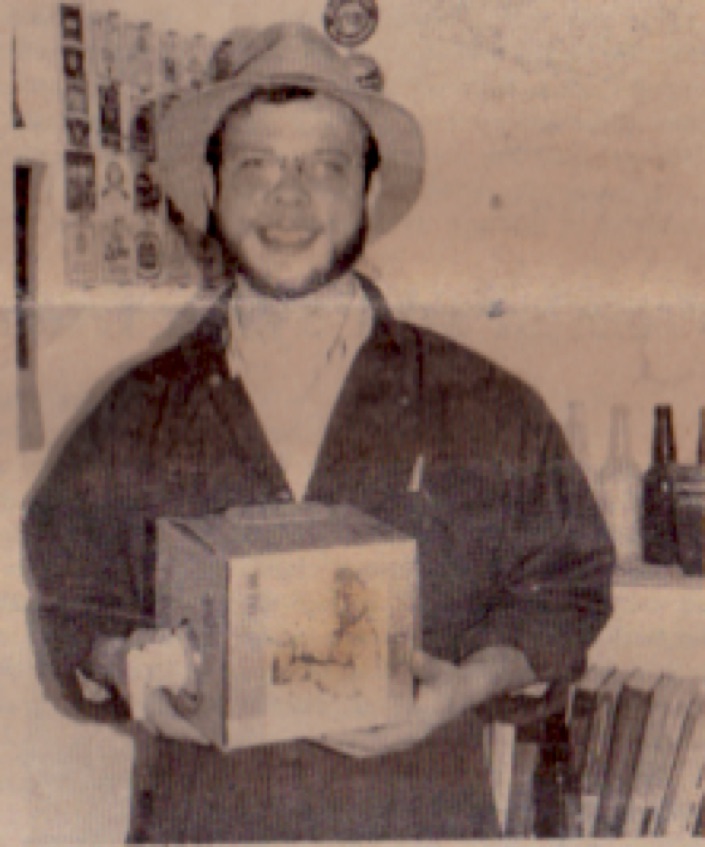
This design is for a refillable gallon ‘cubitainer’ and not for a bottle. At this point I was providing Larry with an etching into which I’d set some lead type and overprint it all myself by hand. These designs were then simply reproduced by offset.
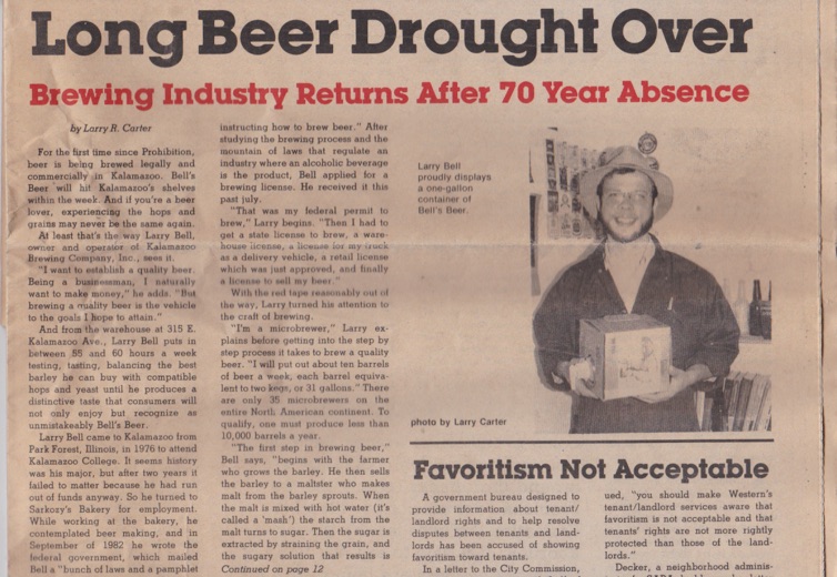
This image appeared on several brews over the years. If you’ll jump ahead and scroll to the bottom, you’ll see a yellowed newspaper article and Larry holding a gallon box of beer. That grainy old newspaper photo unmistakably shows his own mug on the box - the cubitainer of the mid- 1980’s. Back then Larry had trepidations about putting himself on the label, afraid that people would think him ego-driven and full of himself. Get over it, I say; and accept the compliment – eh? The Labels are still nice.
I was raised with the idea that the only beer worth drinking is Czech. If a Czech Pilsner is unavailable, with its endemic yeast strains, perfectly balanced malt character, soft water and Saz Hops, imparting such characteristic and impeccable flavors to the drink of Radegast, that ancient proto-Slavic God of beer, well then and only then, will a German beer do – perhaps even Austrian or Dutch in a pinch, but American beer? That’s different. This behemoth of massive-scale agriculture and industrial production, capable of mobilizing to defeat the axis powers (and Stalin’s minions as an afterthought)? This power, that presumes to tame the wind and waves; which orders the weather about and dumps B-52 loads of Barium salts on continent-wide cloud-formations as well as unwitting human populations; which casually exterminates whole phyla for its momentary pleasure and profit – this unprecedented and unparalleled supremely confident imperial power, in whose belly we somehow landed after the workers paradise under Stalin proved to be something less? Well, this American wonderland was, in spite of it all, a pitifully primitive backwater when it came to beer, bread and cheese....well ice cream and jams too and many other things grotesquely over-sweetened, strangely tasteless and ostensibly edible. America was, in my family’s Czech-centric minds, a vast wasteland of industrially produced goat piss – at least it was back then, before the advent of the craft brewing movement of the 1980s.
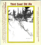
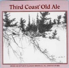
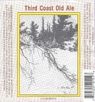
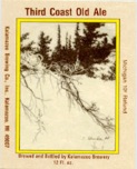
Third Coast Old Ale
Sturgeon Bay - etching with drypoint
impressions available for 200.00 each
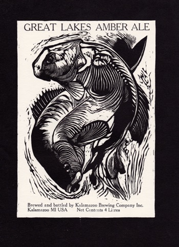
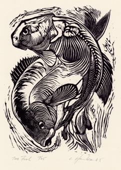
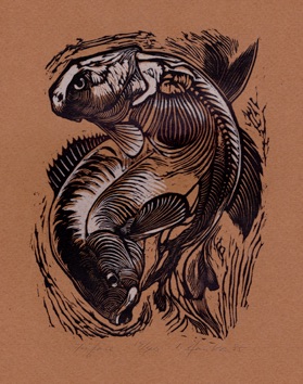
The very first design I submitted to the brewery is the woodcut that you see here of somewhat unclear piscatorial derivation. That is to say; invented fish that are sorta Redhorse or Carplike and they were deep-sixed for many years - Larry being afraid people would avoid buying the beer thinking it might taste fishy - at a time when everything admittedly hung on a thread and having two people not buy a gallon of beer each might have been a catastrophic loss.
My thinking was that fishing goes with beer like a Cubs or Tigers game does. A fishing trip is incomplete without a six-pack cooling in the stream awaiting your foot-sore trudging back to camp at the end of a long day – oh-so welcoming to the sunburnt week-end warrior as he settles his butt into the sedges at streamside and his blistered battered feet into the stream, lighting up a nice big stanky stogie while swatting at deer flies, mosquitoes and black flies. The sun goes down and the world is pretty simple. All is good and right in the world as he pops a beer - balsam to the soul. I was of course right about that, but then again so was Larry when he kicked out the jambs a couple of decades later with a real advertising Coup de Grace - boxes with trout and whole six-pack designs and all else in a blowout piece of packaging extravagance. Below you’ll see that first woodcut design re-appearing, phoenix-like, from its own ashes as an aluminum can design and nestled in its inflorescence of exquisite packaging .
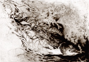
Let There be Trout 1995
Etching with aquatint and drypoint plate size 7” x 9.5” impressions for 185.00
On the banks of the river, I repeat the timeless ritual of marveling at the life I've taken in order to eat and sustain my own. The quickly fading color and perfectly adapted form of the dead predator - in the hands of a larger predator along the food chain - demand attention. I draw it as I actually encounter it – dead and fading. It is a prayer of thanksgiving for the gift of trout, presented within the sinuous branches of Cedar, giving form to the spirit and substance of trout.
I take it as a certain badge of honor that the image on Two Hearted Ale boxes , six packs and bottles was once submitted to the Michigan Trout Stamp competition and didn’t even make the first cut of top ten from a field of 25....I suppose they brought in a fisheries biologist to judge and I was quickly disqualified for an inaccurate count of fin rays or something.
And of course honoring the teller of trout fishing tales means honoring the Brook Trout that informs it all - and even that which is the very underpinning of trout surviving - clean water running into the still drinkable crystalline waters of Lake Superior – just don’t try it in Duluth harbor or Thunder Bay .
Opus Salvelinus - Brook Trout III
etching with aquatint & Drypoint
unavailable
Brook trout - Impressions for 185.00
Stout Fellow #1 Etching with drypoint
Etching available for 125.00
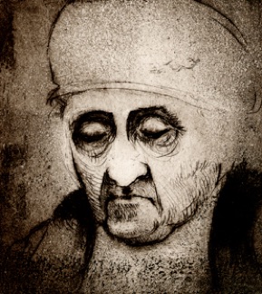
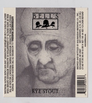
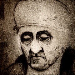
Rye Stout
The elderly granny on our Rye Stout was somebody I drew in Prague and made into an etching in Kalamazoo. She is timeless and seems like somebody that might have been making Kvaas from stale bread anywhere in some Hanseatic city of the middle ages or in the Russian countryside today – maybe having a Lambic in Bruges before returning from market with the proceeds from her eggs and milk. In truth she was more likely to have been a school teacher. I did a series of these women as etchings taken from the hundreds I drew in my time of haunting cafe’s in Prague and Vienna. You can read about all that and see those etchings at the linked page - just click on the picture.
Café Kabuki X - Rye Stout Lady
etching with aquatint and drypoint
Impressions available for 150.00 each

I make my living as an artist and encourage your inquiries.
I try to keep it simple and don’t deal with credit cards or pay pals.
The USPostal Service works just fine
as does a plain old personal check, bank draft or good old, time-tested cash.
Call or e-mail me at 269-388-5631
or send a letter to : Ladislav Hanka
1005 Oakland Dr., Kalamazoo MI USA 49008
Gotta be some kind of predisposition in there to beer as a living substance whose subtleties lie in a relationship to the maker not unlike good cheeses, organically raised foods, saving heritage seeds - things done with full attention and love. I’ve made wine and beer. Bread too. I keep bees. I know.
I still feel a certain proprietary pride in having been there helping to bring this baby into the world and do - yea verily- still enjoy tipping back a beer now and again, taking satisfaction in seeing some of my artwork on the bottles, boxes and cans.
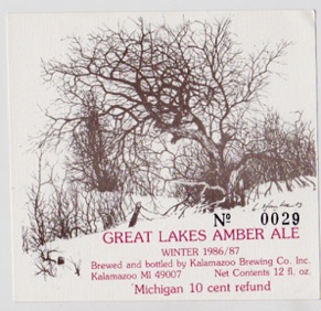
Now here’s a label to make a collector’s heart speed up or to start him into pulling his hair and biting his nails. Nearly every label is different by virtue of a stamped number that must have meant something like a batch number back in 1986/87 when batches were several cases of beer. There’s an awful lot of numbers out there somewhere – at least potentially. Collect them all, or be incomplete - right?
Fish - Chiaroscuro woodcut 1984
impressions available for 100 each
Fish - woodcut - impressions available - 100.00
Two Hearted Ale
Kalamazoo Stout
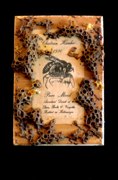
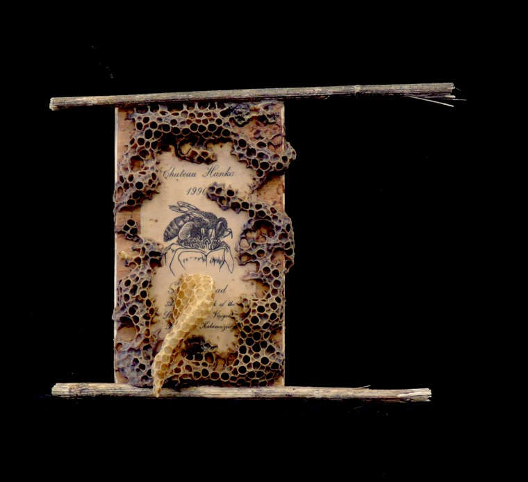
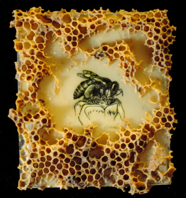
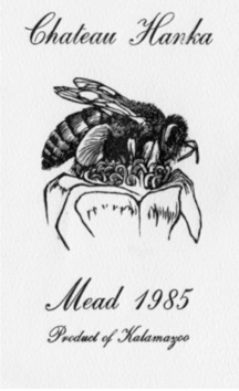
And to bring it all to a close - a label design for something not at Bell’s or even beer - but for my own father’s mead – a tiny wood engraving of a bee which I then immersed into a hive for living bees to complete with accretions of wax and occasionally even capped honey. There are other labels for my own liqueurs & for dad’s libations, to which you can be linked by a click on the Mead Label above. My beekeepers page is linked to the other bee image on the right with the beeswax accretions and there you will encounter all sorts of art from the Beehive. Good luck and Godspeed.
This wood cut of some stylized Hops was made for Gary Schils & Sylvia Jania, who started a modest Hops Farm in Emmet County and wanted some kind of a Logo. The Hops Farm never really made it as a commercial enterprise, but I imagine the woodcut will find use someday as a Furkin Hand Pump decoration, label or logo at some brewery.

artwork by Christine Saari: Marquette MI -
a real piece of self reflective Yooper artwork one might say -
but of course made by an academic artist who resides for part of the year in the Salzkammergut of Austria.
Her book entitled; Love and War at Stag Farm (Hirschengut) is a heartfelt piece of writing from that family farmstead and is seen mostly through the correspondence between her mother back on the farm, fighting to wrest a living from the unyielding mountainous terrain and her father, off and in constant mortal danger on the Russian front through the Second World War. This is compelling and very humane reading that breaks through the many stereotypes of war to which we have so easily become accustomed from afar - thinking we know so much more than anyone can realistically know.
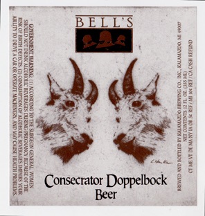
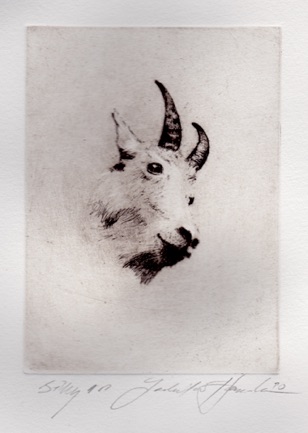
Billy goat - drypoint on copper plate
I look at this happy old Hippie and backwoods character and think he’d sell a lot of beer - fitting the self-image of many an avid beer drinker across this country - perhaps a funky Backwoods Brew appearing in duck blinds all across the US of A - maybe even a Set me Free Ale , or more daring - A Magic Mushroom Beer , flavored subtly with a cocktail of immunity-enhancing pheasant-tail Mushroom extract, Maitake or Shiitake mushrooms. Bob – enticing us from beyond the grave to suspend judgement, have some fun and enter his natural pharacopeia.